Parisine Office
Parisine Office is a double typeface: Set serious and crazy texts with the same typeface depending the OpenType features applied. Parisine Office feature proportions and xheight much more suitable for text setting than Parisine.
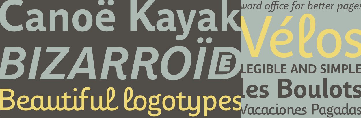

Parisine Office can be considered as the text version of the Parisine. When Parisine xheight fit Helvetica large xheight, Parisine Office is more close to Gill Sans in term of proportion, as it was developed for Ratp, the public transport in Paris to allow compatibility with documents set in Gill Sans without changing the length of text.
Parisine Office by default is a humanistic sanserif available in 4 series perfect for text setting. When OpenType features activated (in Pro version), it transform radically into a ligatured sanserif and change dramatically any texts, from caps setting to lowercases settings. The design of the italic lowercases is more cursive than in Parisine. Several sets of figures are provided—standard, oldstyle, and lining—in tabular and proportional widths as many usual OpenType features.
RATP projects: Parisine Office Pro only
Parisine Office Pro was originally created by Jean François Porchez for RATP in 2005. With your authorisation from RATP, contact Typofonderie to obtain the additional TrueType version called Parisine Office in TrueType format (without suffix) for no supplement to your orginal Parisine Office licence, but required if you work on any RATP projects.