Nespresso + new Italics!
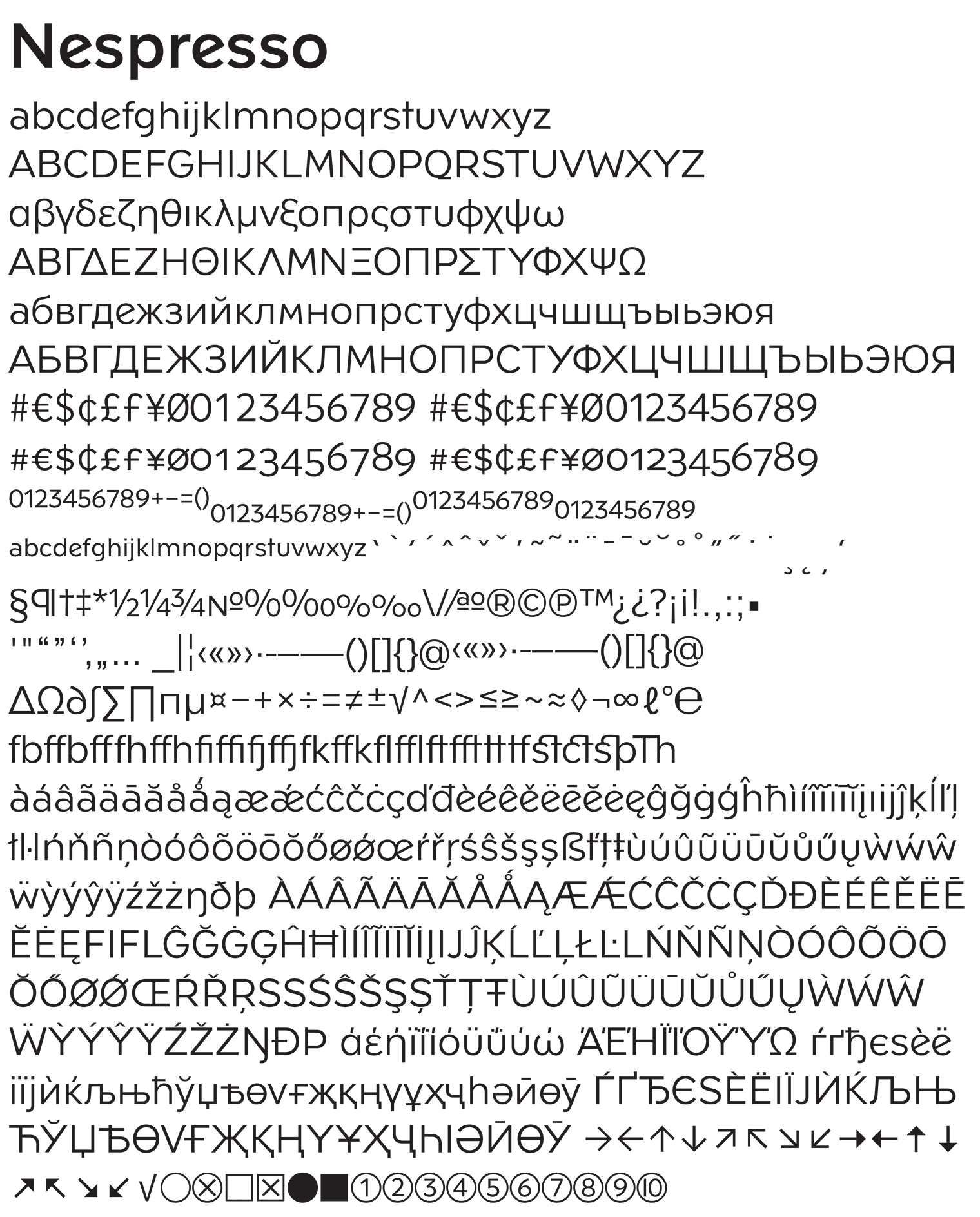
The bespoke Nespresso alphabet can be definited as geometric mono-linear typeface. Some of its details come from vernacular italian lettering style, when other elements are typical from Art-déco style. Nespresso use typical Italian vocabulary for its products, following the same path, Nespresso typeface aim is to strenghten Italian typographic style, even as a delicate, subtile homage to the home of the best coffee in the world. Born during Art-déco period (circa 30’s), geometric sanserifs are a synonym of pleasure, parties, nightlife, couture, bistro, brasseries. We can find this typographic style in Italy, Spain, France, United Kingdom and USA at the time. Today, because of the iconic Chanel brand designed in a Art-déco typeface style, such letterforms are strongly associated to luxury.

Nespresso
The bespoke Nespresso alphabet can be definited as geometric mono-linear typeface. Some of its details come from vernacular italian lettering style, when other elements are typical from Art-déco style. Nespresso use typical Italian vocabulary for its products, following the same path, Nespresso typeface aim is to strenghten Italian typographic style, even as a delicate, subtile homage to the home of the best coffee in the world. Born during Art-déco period (circa 30’s), geometric sanserifs are a synonym of pleasure, parties, nightlife, couture, bistro, brasseries. We can find this typographic style in Italy, Spain, France, United Kingdom and USA at the time. Today, because of the iconic Chanel brand designed in a Art-déco typeface style, such letterforms are strongly associated to luxury.
The quest for excellence
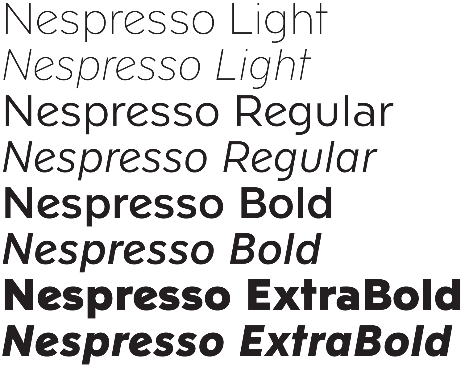
Nespresso typeface will bring purity, class and a worldwide understanding of what means luxury and style in Nespresso’s branding. “Le dernier chic.” A delicate style, enough neutral to be used by Nespresso for any communication, from highly technological content to lifestyle and coffee savoir-faire. This new typeface will be dedicated to convey Nespresso quality and innovation. Nespresso fonts works well in every weights, and sizes. It is a very open, legible typeface that will bring to body texts a good readibility. In large headlines, titlings, its purity and unique design will bring a timeless elegance, specific to Nespresso branding. This new typeface, created for FutureBrand is the quest for excellence that reveals the essence of the Nespresso brand. Italics have been added a year later.
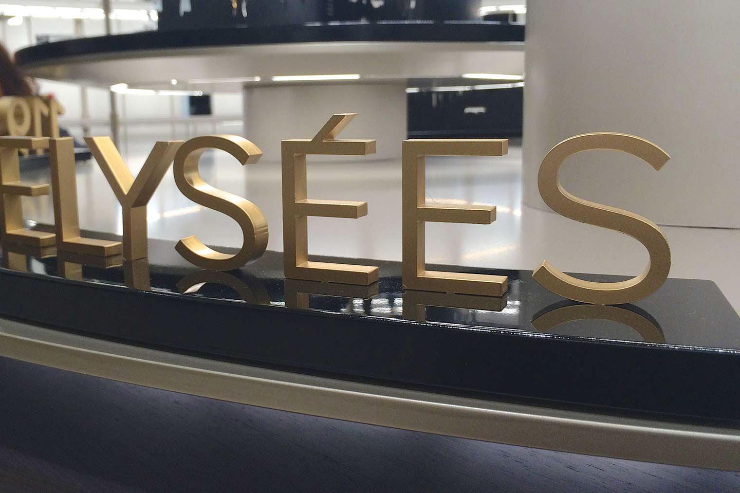
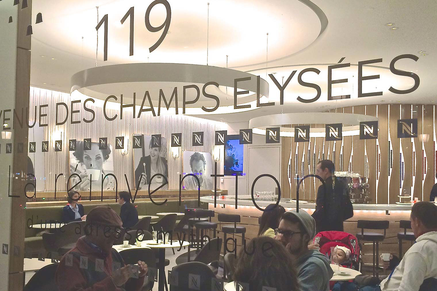
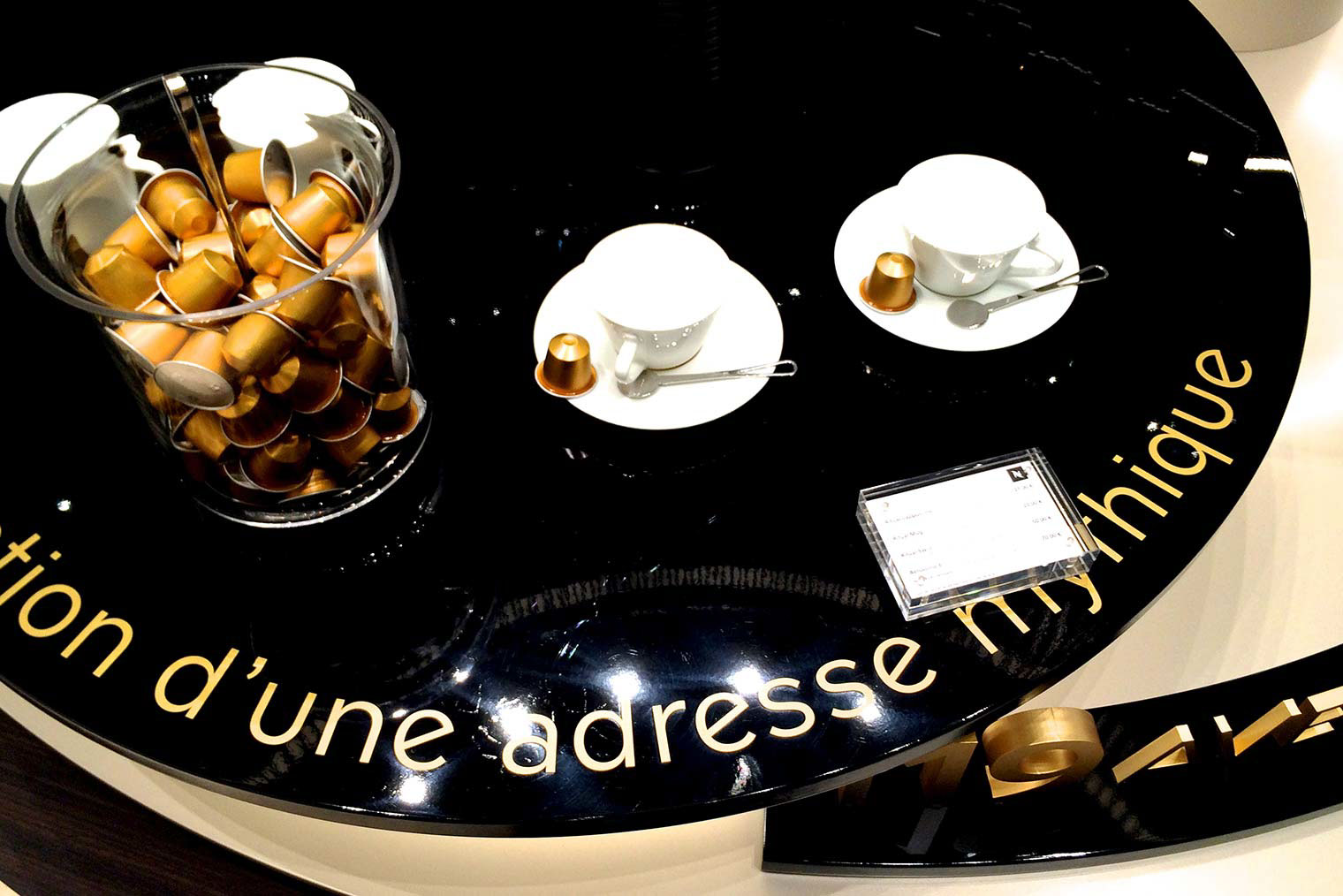
Nespresso Bespoke typeface in use
The first appareance of the Nespresso typeface family was for the relaunch of the flagship store in Paris, Avenue des Champs-Élysées in October 2014. Few images below…
Copyright
Typeface family covering Latin, Cyrillic, Greek is designed for an exclusive use by Nespresso and will never be publicly available.
Typeface family covering Latin, Cyrillic, Greek is designed for an exclusive use by Nespresso and will never be publicly available.