Le Monde Sans
Le Monde Sans by Jean Francois Porchez: Humanist sanserif typeface in 9 weights in romans and italics.
http://typofonderie.com/fonts/le-monde-sans-family


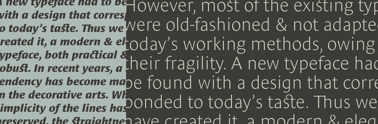
Designed by Jean François Porchez, Le Monde Sans is a sanserif based on Le Monde Journal — a practice that become commonplace from early nineties. Designed originally in 1994 for the Le Monde newspapers, it was expended over the years to the large family we know today. As many others members of the extensive Le Monde family, Le Monde Sans was revamped for the relaunch of Typofonderie website. Le Monde Sans Pro features now a “traditional g” (access via OpenType features) in addition to the usual 1994’s g. Le Monde Sans is offered in numerous weights — nine in total, in roman, italic to meet all kinds of situations. Several intermediate weights added such as the Book and ExtraDemi have been added. It will help designers to select the best weights depending their needs, from glossy paper printing to high resolution screen as the recent iPad and its retina screen.
More details here: Le Monde Sans
Few in use: