Anisette
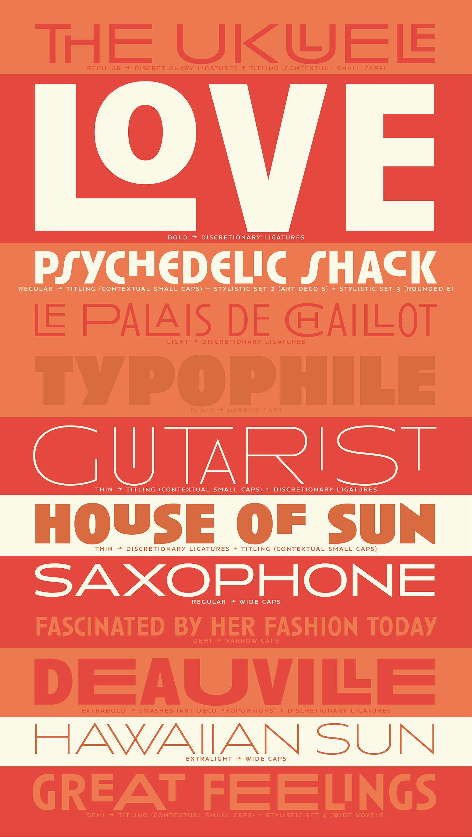
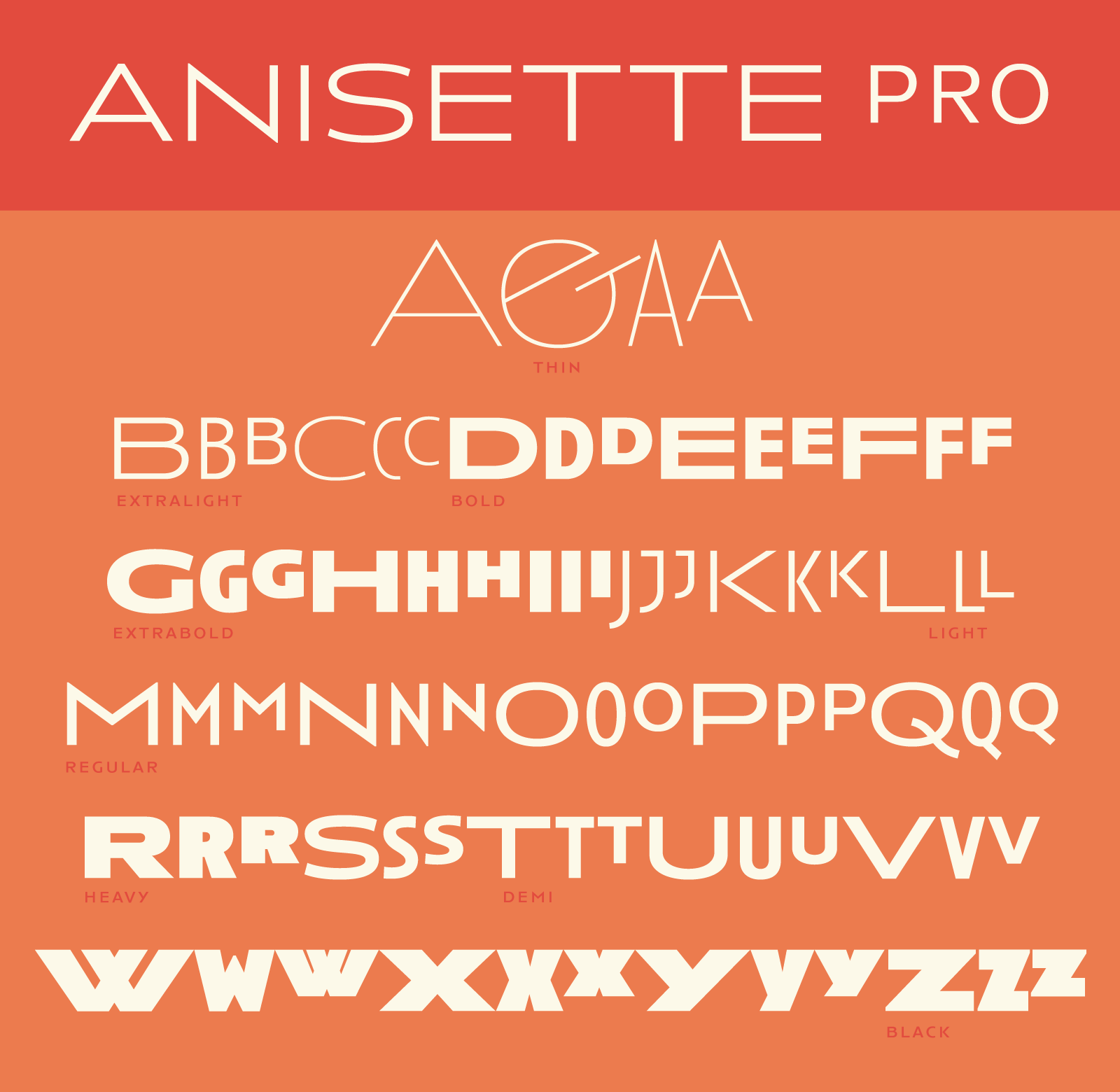
Anisette by Jean Francois Porchez: Art deco sans serif in 9 fonts full of features.


Anisette has sprouted as a way to test some ideas of designs. It has started with a simple line construction (not outlines as usual) that can be easily expanded and condensed in its width in Illustrator. Subsequently, this principle of multiple widths and extreme weights permitted to Jean François Porchez to have a better understanding with the limitations associated with the use of MultipleMaster to create intermediate font weights.
Anisette built around the idea of two widths capitals can be described as a geometric sanserif typeface influenced by the 30s and the Art Deco movement. Its design relies on multiple sources, from Banjo through Cassandre posters, but especially lettering of Paul Iribe. In France, at that time, the Art Deco spiritis mainly capitals. Gérard Blanchard has pointed to Jean Francois that Art Nouveau typefaces designed by Bellery-Desfontaines was featured before the Banjo with this principle of two widths capitals.
The latest version of Anisette reinforces the initial idea by adding an outfit set of connected capitals and contextual forms. Because of the benefit of OpenType features, the Anisette advanced typography is easy use in any work of graphic designer. Indeed, the wide and narrow capitals can alternatively be used alone, mixed manually since the early days of Anisette. Today the resulting mixture is provided by various context functionnalities, providing alternative settings. Many capitals ligatures sometimes in narrow as in wide versions are embellished with small capitals aligned on top of capitals which are positioned contextually in key locations in your headlines. A simple sentence will be as diverse in its representations, as the number of Anisette variables available to the user. With Anisette, typography becomes a game, as to design any title page as flamboyant as if it has been specially drawn for it.
Anisette Petite, the right complement to Anisette
The complementarity between the two typefaces are these wide capitals mixed with narrow capitals for the Anisette while the Anisette Petite – in its latest version proposes capitals on a square proportions, intermediate between the two others sets. Anisette Petite proposes capitals in a square proportion, intermediate between the two other sets, all of which are interchangeable. In addition, Anisette Petite also includes a set of lowercase letters. Its style references shop signs present in our cities throughout the twentieth century.
Anisette: Availability of the new typeface family
The new Anisette OpenType fonts are available in our exclusive PRO and STD fonts version
Download the Anisette specimen.
→ € 45 by style, STD version
→ € 55 by style, PRO version
→ € 119 for the 4 basic weights, version STD
→ € 146 for the 4 basic weights, version PRO
→ € 243 for the Full family, version STD, 9 styles
→ € 297 for the Full family, version PRO, 9 styles
Download the Anisette specimen.
→ € 45 by style, STD version
→ € 55 by style, PRO version
→ € 119 for the 4 basic weights, version STD
→ € 146 for the 4 basic weights, version PRO
→ € 243 for the Full family, version STD, 9 styles
→ € 297 for the Full family, version PRO, 9 styles


